

You’ve already met the lead artist for ARCTICA, Christine Aubertin, who painted the 160 beautiful illustrations of Arctic animals for the game. Now we’d like to introduce you to the second artist, Emilien Rotival… 🖌️
Emilien Rotival is responsible for the impressive Arctic map that is the playing board of the game, the Generation (player) board illustration, the Event tiles, as well as the Generation Cards that each player starts the game with. 🤍
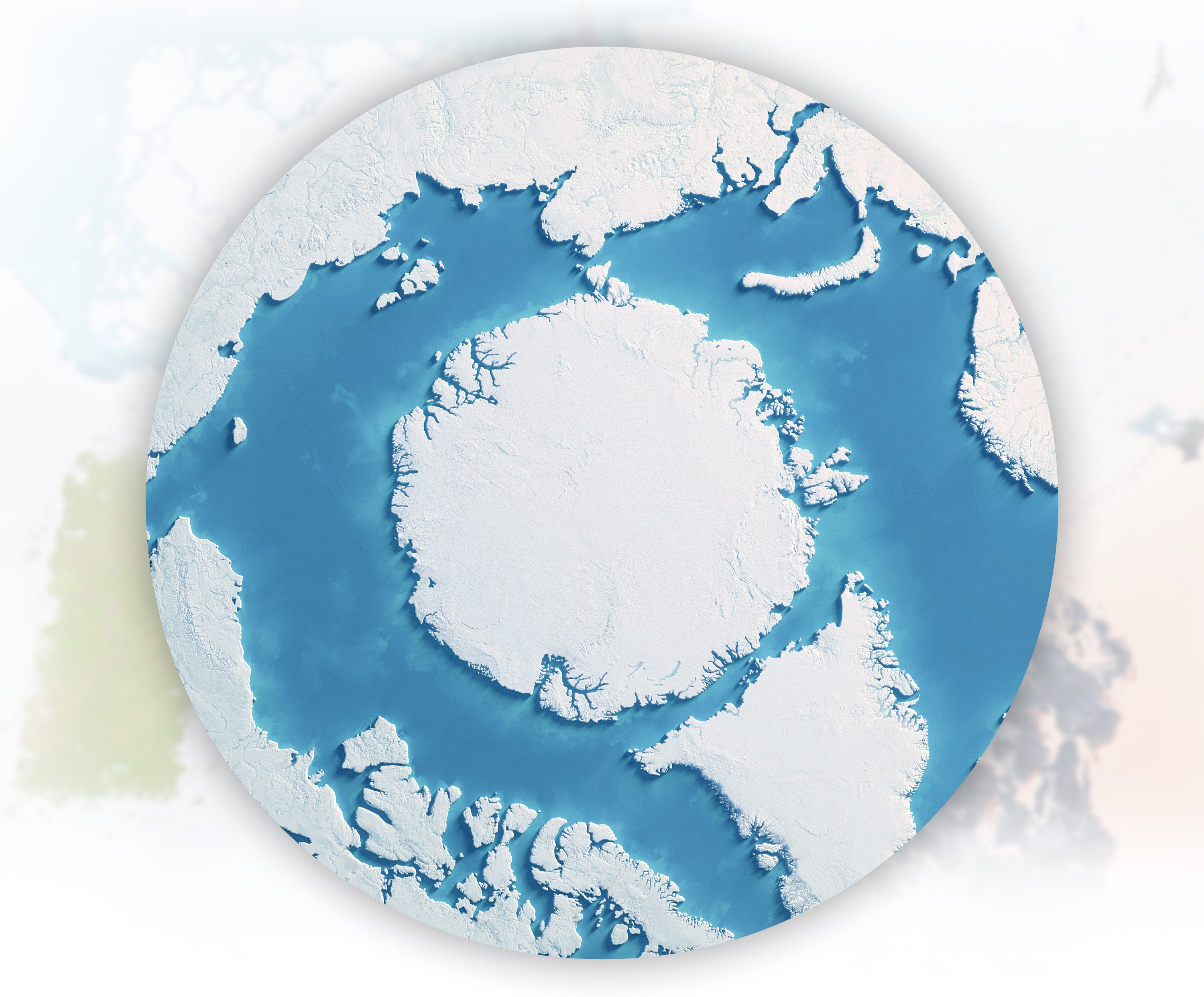
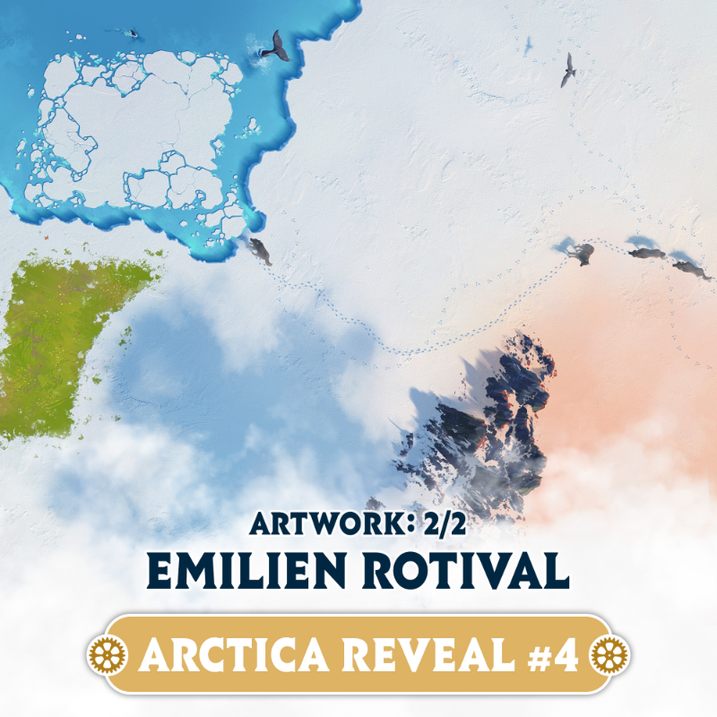
Illustration of ARCTICA main game board
We asked Emilien a few questions for our followers to get to know him better…
How did you become involved in the ARCTICA project?
I knew Rémi from a prior collaboration on Ancient Knowledge, a game he authored a few years ago. We met by chance last year (2025) at the Cannes game festival and I guess that’s when he considered recruiting my services for Arctica.
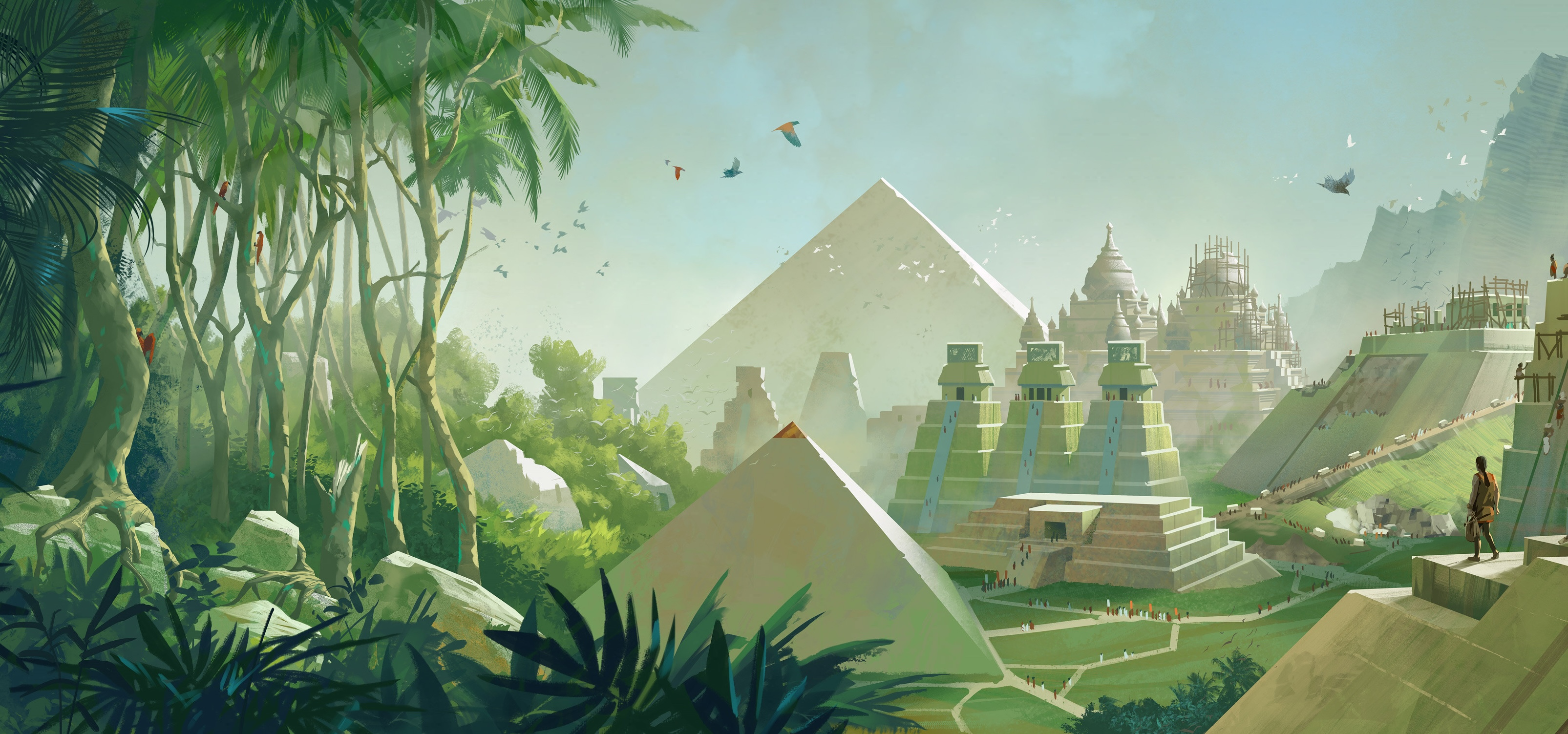
Detail from an Ancient Knowledge player’s board
How much research was done of the actual topography of the Arctic, and what types of changes were necessary to fit the gameplay from the designers?
We tried to stick as close as reasonably possible to real-world topography, while accommodating the needs of gameplay and UI design. The board is based on satellite maps made available by NASA, and tries to balance a snow and ice coverage that could roughly match an actual winter. We did however remove the occasional patch of land and ignored ice floe in places so that there can be a nice clear ring of sea surrounding the polar cap, making way for the UI.
Satellite view of the Arctic Circle
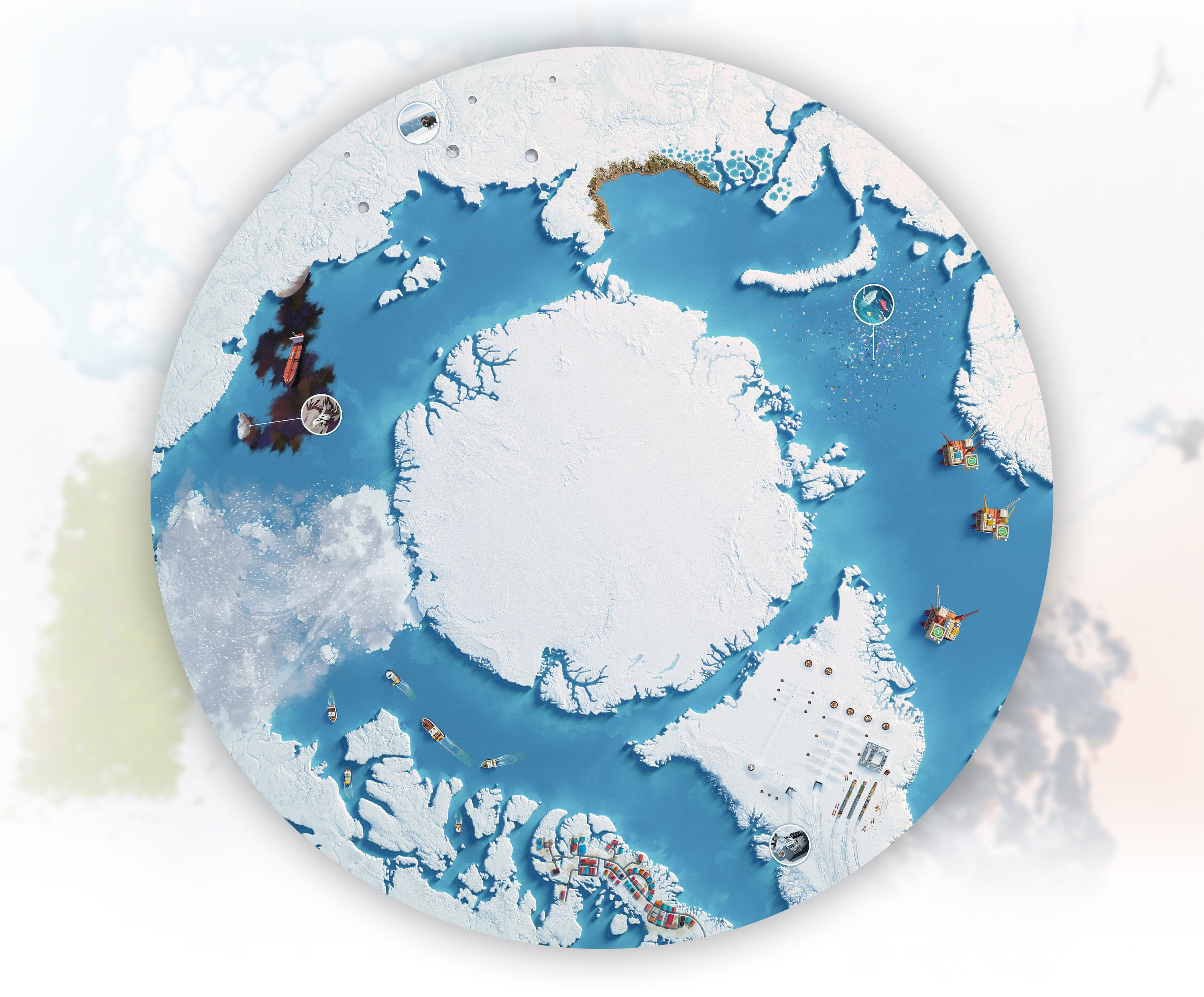
Illustration of the game board with event tiles integrated
What came first? The gameplay elements or the map? Did one inform the other, or was there a constant back and forth of changes (and if so, how many iterations of the map were there)?
Gameplay elements and the UI were defined in the early prototype that had already gone through multiple revisions when I started to illustrate. A couple elements were moved around afterwards in order to accommodate the final illustration, but I don’t think any major changes occurred at that point.
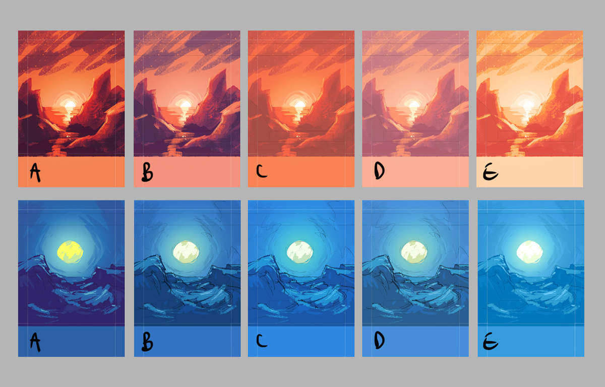
What was the goal for the art on the Generation cards, and what types of changes did they go through – and why?
The primary aim of the artwork on the Generation cards is to help players associate them with the appropriate gameplay visuals – orange for short generation, blue-green for long generation. Additionally, the front and back of each card indicates the passing of time with the rising celestial body, and an overall increase in luminosity. Which is how we ended up picking sunset and dusk as respective themes.
Roughs for long and short Generation cards
We initially went through a sketching round that tried different approaches for each card, with varying degrees of artistic liberties in regards to color and atmosphere, before settling for the semi-realistic compromise that you will see in the game.
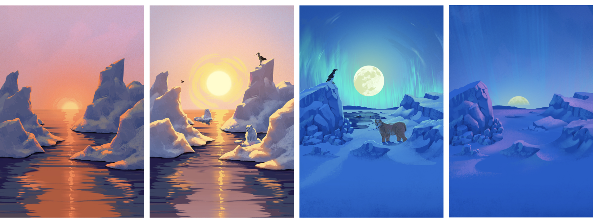
Final artwork for the short and long-Generation cards (front and back)
What type of tools / drawings technics do you use in your illustration?
Really, it depends on the projects. I learned art with traditional tools and still enjoy them to this day, but professionally I’ve been using digital — mostly Photoshop with a pen tablet — for as long as I can remember, because of how flexible it is. For complex images such as the Arctica board, I use a 3D base that I then paint over — either complete with textures, as was the case here, or sometimes just a rough geometry block-out to speed up the drawing and light sketching phases.
For simpler images such as the Generation cards or player boards, I go straight to drawing and painting in Photoshop.
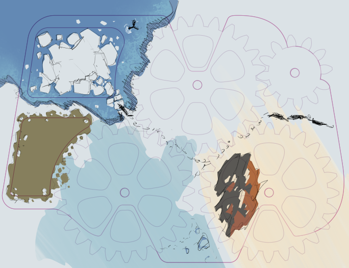
Rough for the Player board
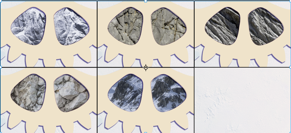
Texture tests for rocks present under the short generation wheel
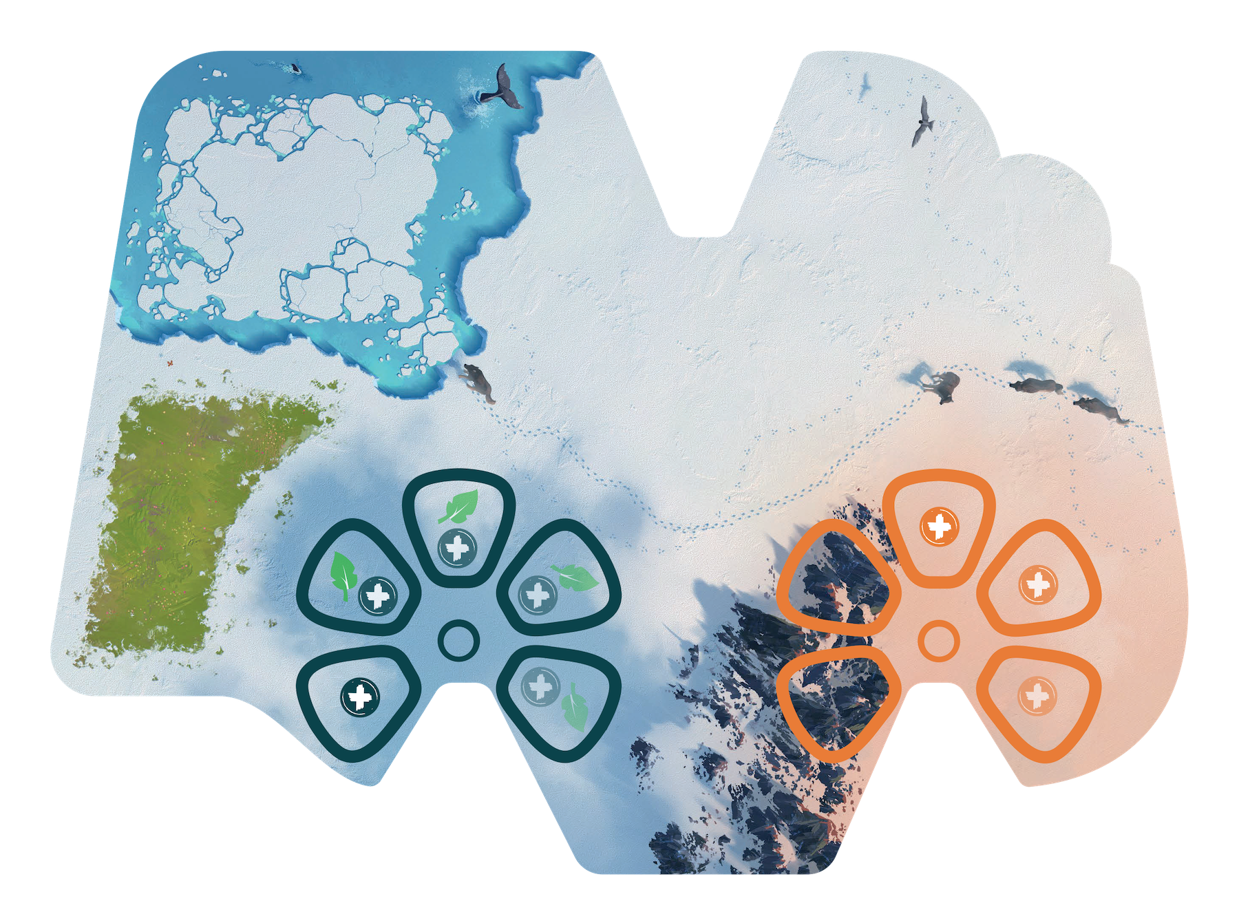
Final illustration of the set with UI overlay
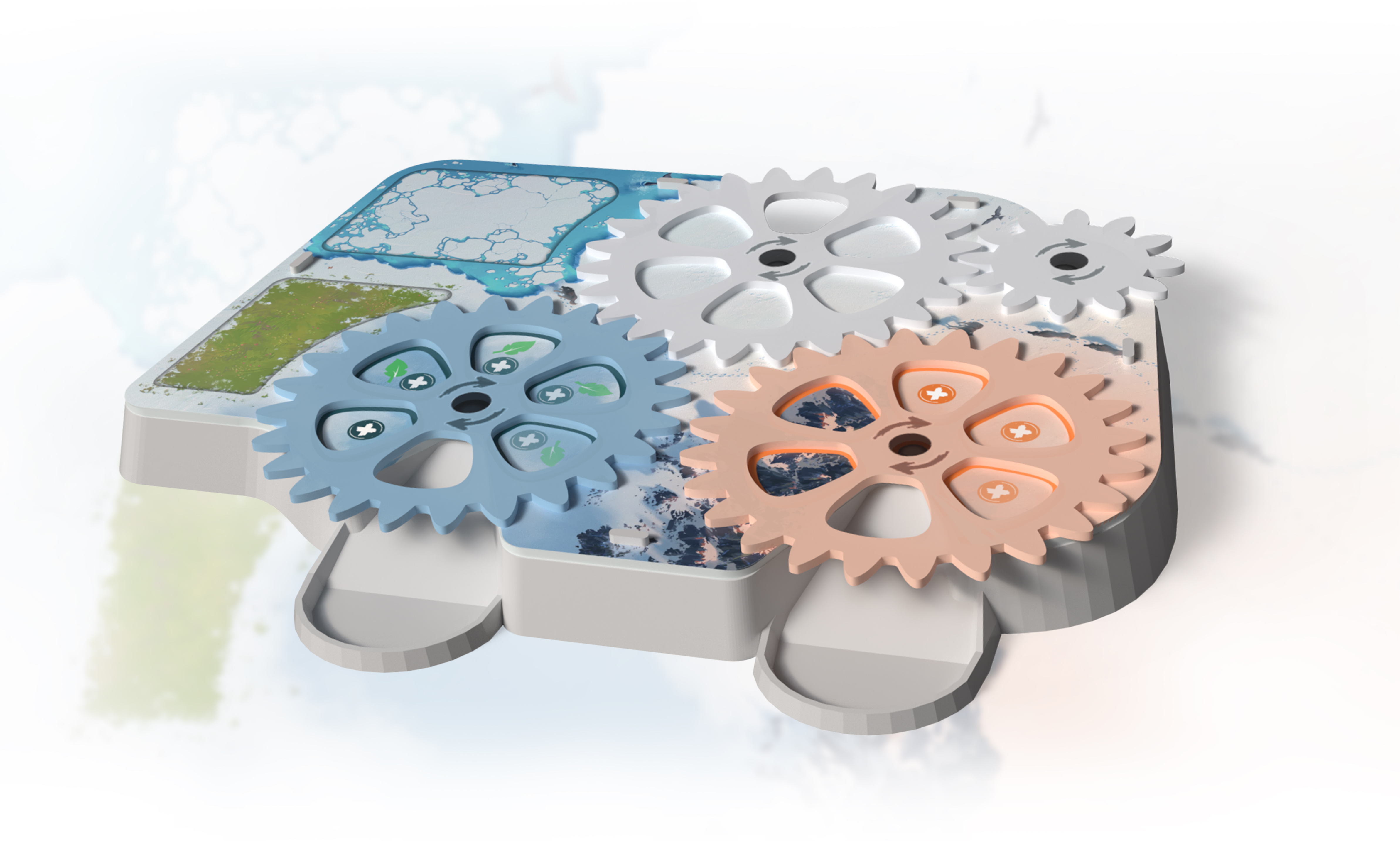
Final 3D rendering of the player platforms
How does inspiration work for you? What is your way of working?
This also depends on the projects. Sometimes the brief is so precise that just reading it evokes a clear picture and it’s practically a roadmap with little need for research or experimentation, going as far as to include the client’s desired moodboard.
Other times there is more freedom and I end up searching the web for inspiration – Pinterest, mostly, but also photography archives and occasionally some good old paper artbooks. Pencil sketching may occur on such occasions.
It sounds you have worked on Ancient Knowledge before — was it challenging? Have you worked on other boardgames?
Professionally I have been doing all sorts of illustration — entertainment previsualization, children’s magazines, video games, first aid training, motion design… for almost 15 years.
When it comes to board games historically I worked with Bioviva, but progressively I had the
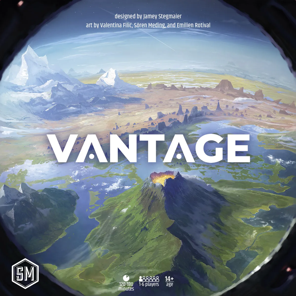
pleasure to collaborate with more editors and board games and they now take a prominent place in my activity. Notable projects in recent years include a revamped board for FENTasy Games’ Yinzi: Ming, Stonemaier’s Vantage (possibly my biggest game to this day), Iello’s Popcorn, and of course Ancient Knowledge.
That last game was when I met Rémi. We were introduced by the project manager at that time and I spent a thrilling year or so working on the many cards of the game, complete with player boards and cover. The main challenge was to adopt an art style that would remain consistent throughout the work of different artists — there were three of us. Afterwards we also created additional cards for an expansion pack, plus a series of four Twist puzzles based on the artwork of player boards.
