
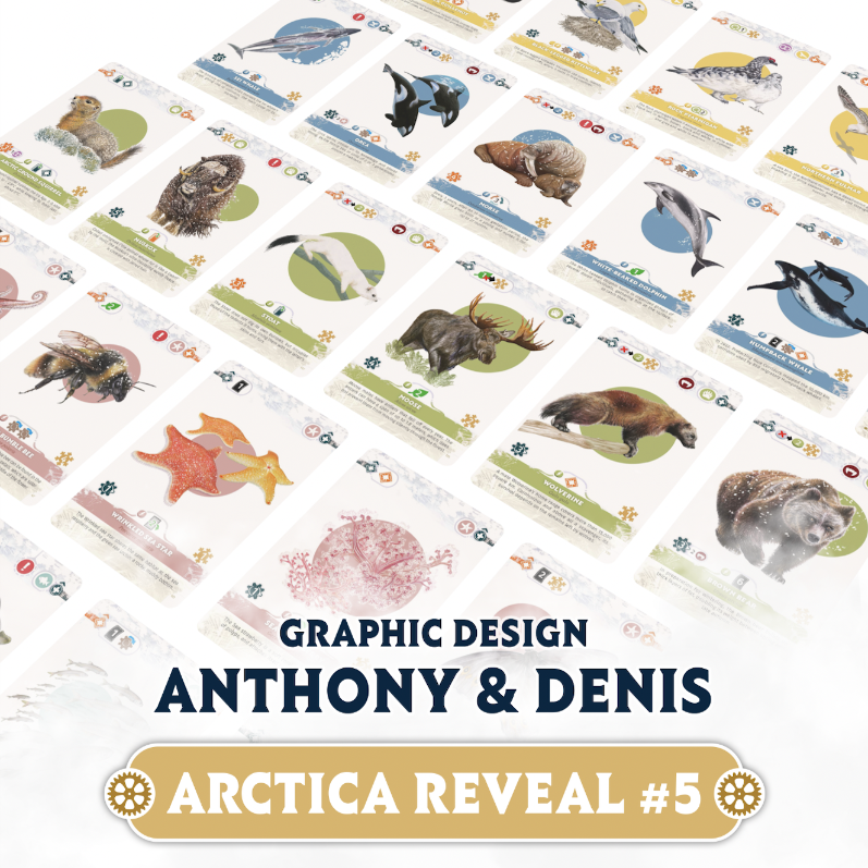
Game design is more than just the work of the authors and illustrators. Graphic designers are a key part of what can make (or break) a game. Visual clarity and component functionality are what make games “playable” for the masses. ☺️
For the ARCTICA project, there are two graphic designers: Anthony Questel was first brought in to start all of the initial groundwork for the design, creating an overall art direction and perfecting the functionality of the unique Generation wheel player boards. Our longtime graphic designer Denis Hervouet also came on board to help finalize the cards, while also designing the rulebook and campaign page.
We talked to both about their process:
* Anthony Questel *
You started from Christine Aubertin’s existing illustrations: how did you build a cohesive art direction around her work? 🎨
First of all, I had to do some research to see what was being done graphically in games with a strong Nature theme.
That makes it possible to understand the habits and visual codes of the genre, so you can reinterpret them, bring your own personal touch, and add your own artistic vision.
Then, I had to create several graphic explorations to find what would best match both Christine Aubertin’s illustration style and the vision of the game’s designers.
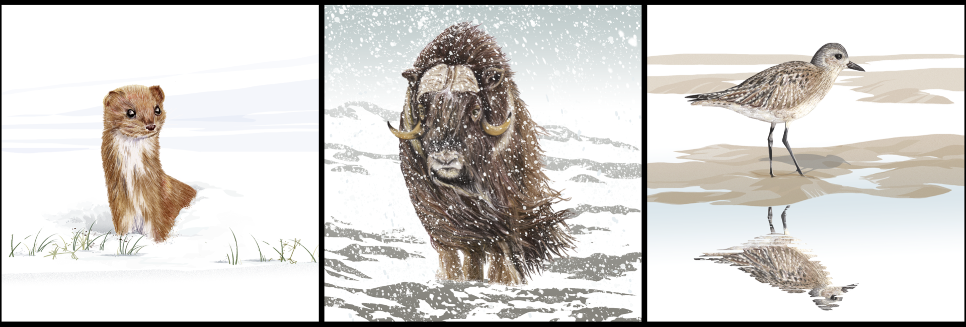
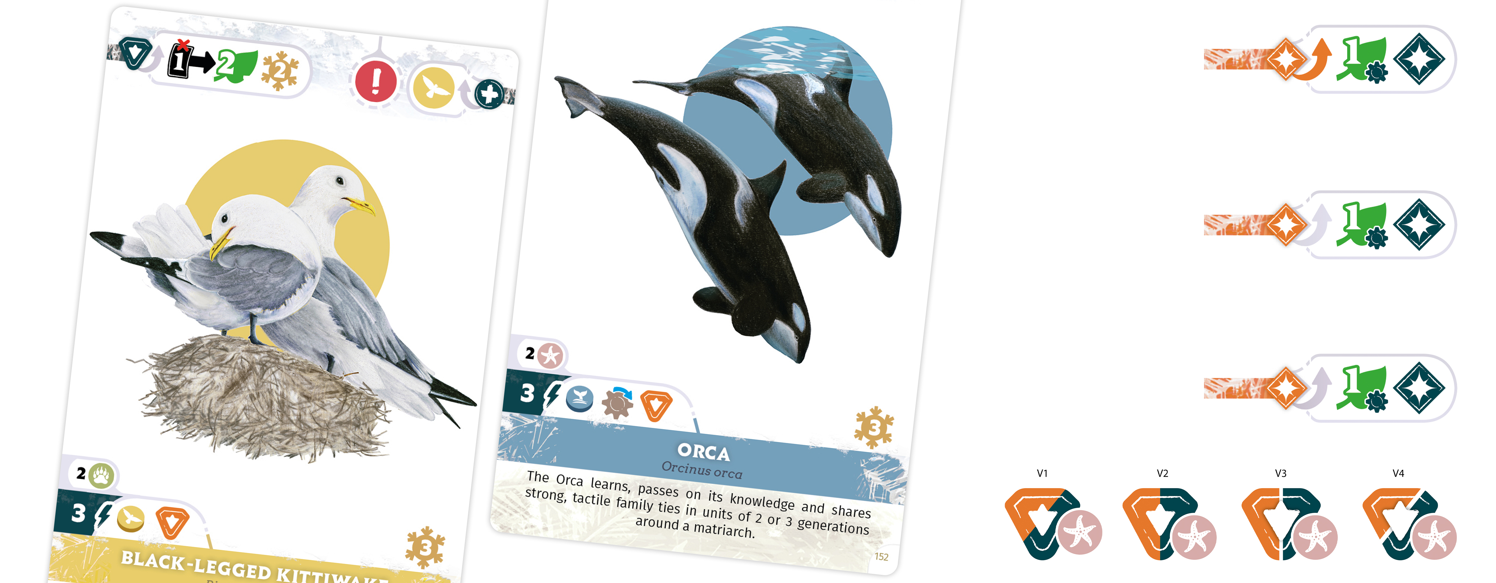
The realistic animal drawings, full of detail and made with colored pencils, clearly had to take center stage on the cards. So it was decided to keep the graphic elements very simple, so they wouldn’t overpower the animals.
The slightly irregular look of some frames and icons also helps echo the sketch-like quality of the drawings, which strengthens the connection between the illustrations and the graphic elements that make up each card.
How did you create a strong connection between the illustrations and the gameplay elements such as the cards? 👀
The challenge was to successfully convey the Arctic theme while still keeping the graphic design easy to understand.
Given the number of icons and colors present in the game (Region outlines on the map, icon colors, card family colors, and player colors), it wasn’t realistic to go for an ultra-detailed, highly realistic design — which actually aligned perfectly with the design choice made for the Animal cards.
So using graphic elements with simple shapes and a fairly minimal appearance became the natural direction. This simplicity allowed me not only to focus more on textures (snow, ice, frost, sketch-like effects, etc.) to create a link between the illustration style and the game’s overall graphic design, but also to preserve as much readability as possible despite the large number of icons present both on the main board and on the cards and tiles.
You worked on the Generation (player) board and the Wheel systems: what were the main technical constraints you had to anticipate to make the components both beautiful and functional? ⚙️
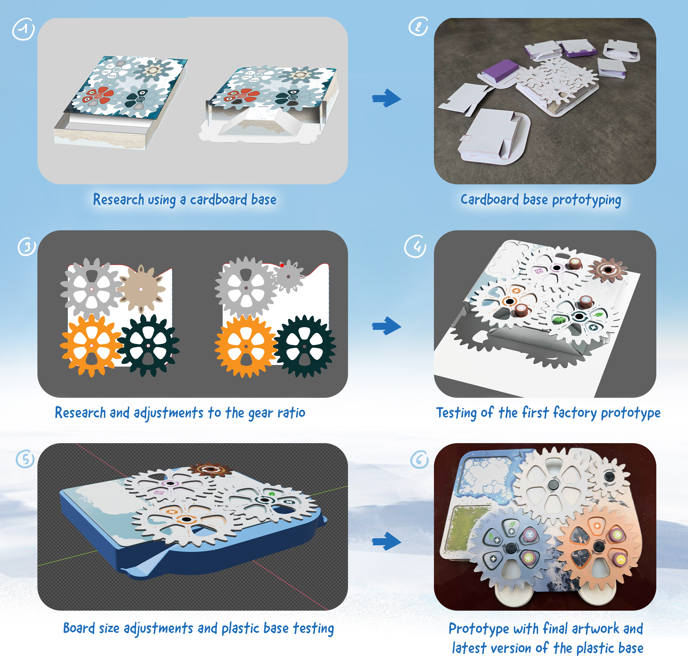
Given the uniqueness of the board and its semi-automated system, it was difficult to anticipate all the constraints we would face, because it was the first time we had worked on this kind of mechanism.
But the main issue we encountered was the size of the wheels and of the board itself.
That impacts storage, the size of the game box, the amount of table space the game takes up, and also the amount of room left for illustration on that component.
The wheel shapes themselves were also a major constraint.
The fact that they needed to hold a certain number of tokens, that those tokens needed to be able to fall off at the end of their path, and that all the gears had to cover identical distances forced us to think about their size, their placement on the board, the board’s shape, and the support structure all at the same time. That required a very large number of tests before reaching the final product.
And it was only once the final overall board shape had been completed that the board’s illustrator, Emilien Rotival, was able to add their personal touch to make everything aesthetically pleasing while adapting to the shape of each element.
What “invisible” element for players required the most work from you? 🔎
There were actually two on this project: preparing the files for print testing, and calculating how the wheels would function.
Preparing print files for a board game project is a time-consuming step because of the number of details you need to pay attention to. Each component in a game requires different treatment depending on the material used, its structure, its shape, and its size.
That means gathering some files together, separating others, and checking for each of these new files—confirming their print settings and respective formats in order to ensure optimal quality during production. The more components there are with different and complex characteristics, the longer this stage becomes.
As for the wheels, that was fairly new to me, because beyond simply making wheels that turn, I had to figure out how to create wheels that would rotate based on the activation of a single smaller gear, so that the distance traveled by the tokens on each of them would match.
Without going too far into detail, figuring out the wheel sizes, the number of “teeth,” the size of those teeth, and how all of that interacted with the number of token holes required me to learn the principles related to gear ratios.
* Denis Hervouet *
You’ve been working with This Way across several projects (ICE, Founders): what does this long-term collaboration bring to a project like ARCTICA? ❄️
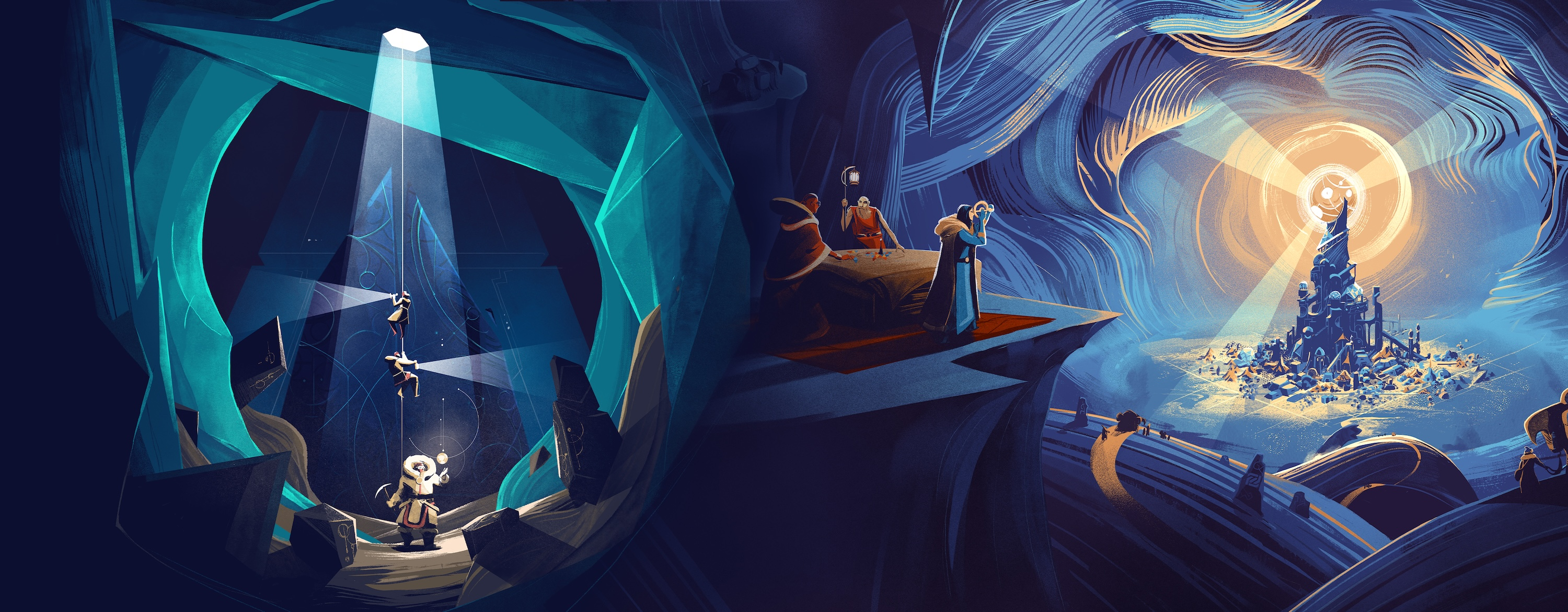
The main advantage is knowing the team well and the smooth workflow that naturally comes from that during the collaboration. We know how each person works, and we understand each other’s different needs quite quickly.
And being able to add lots of GIFs to our exchanges — that’s absolutely essential!
You’re joining the project as a complement to Anthony’s work: how do you organize that collaboration to maintain strong visual consistency? 🙏🏻
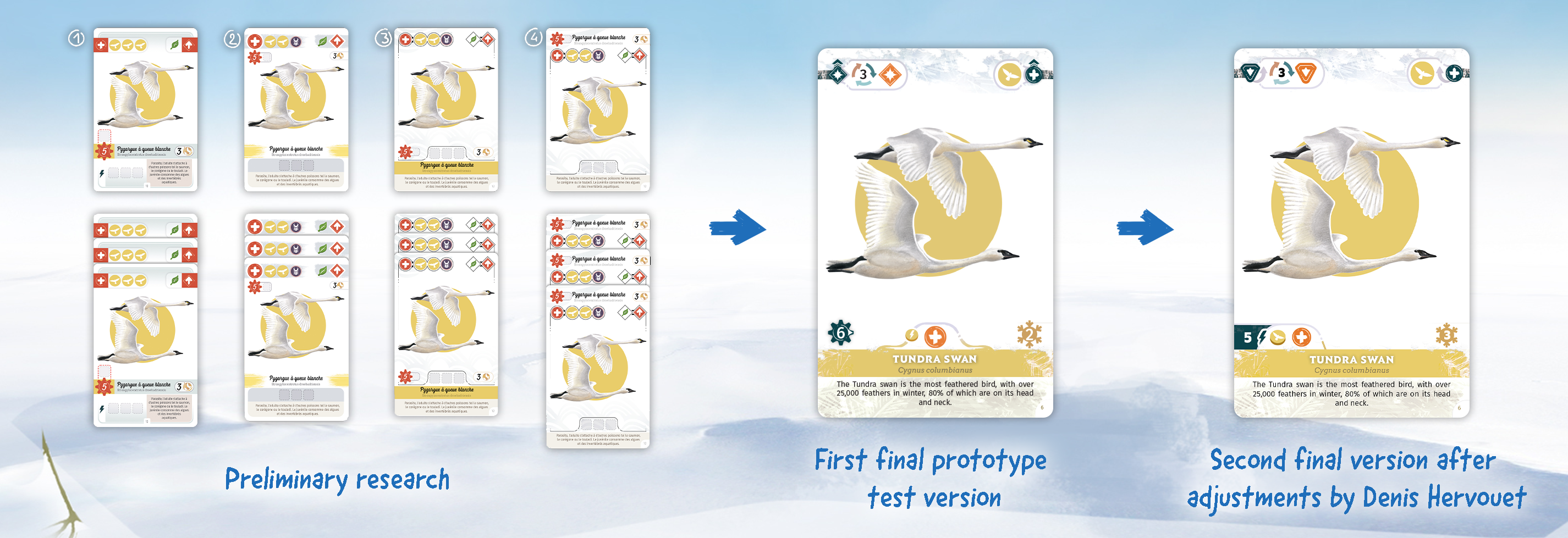
Anthony and I know each other well—we’ve already worked together before (and played quite a few games too!)—so one of the strengths of this collaboration is that we can communicate easily and trust each other’s work. He built the entire art direction for the world of ARCTICA with This Way, and I then took over for the cards and the rulebook creation. Good communication upstream, followed by regular exchanges along the way, allows us to maintain the visual consistency he established at the start of the project.
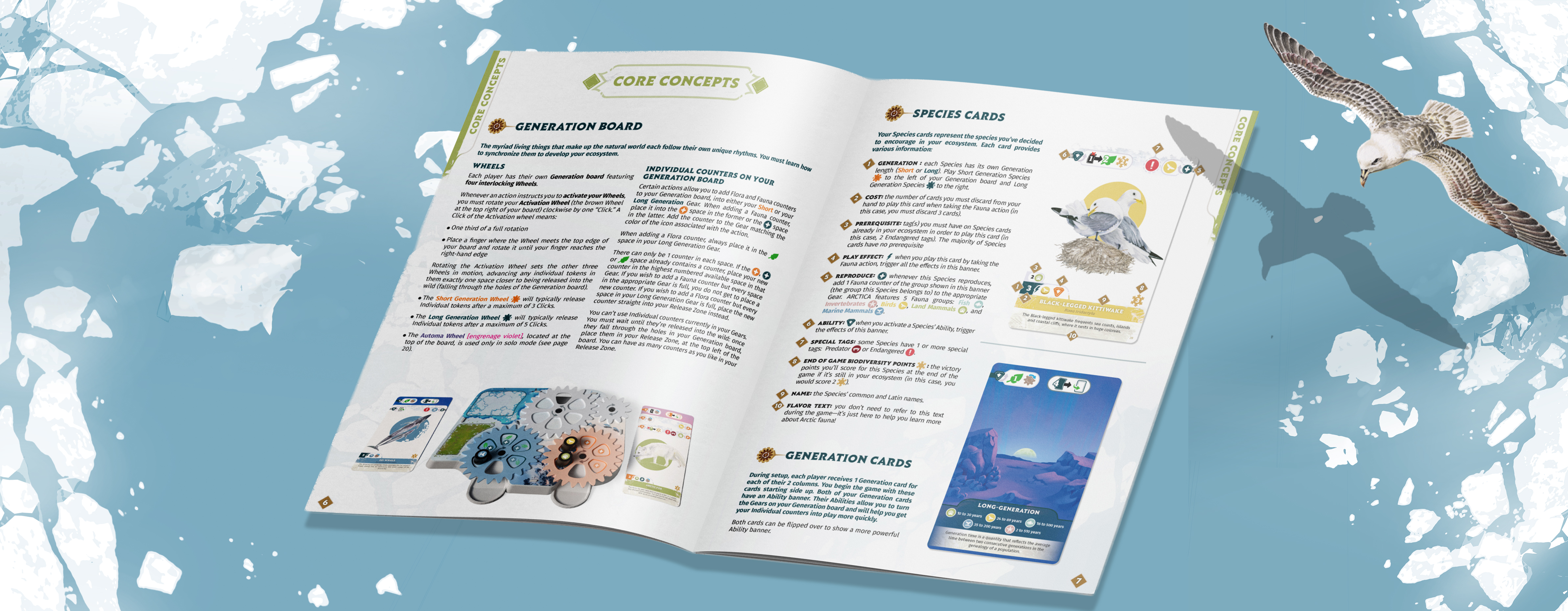
You designed the rulebook: how do you make a game readable and accessible without losing the richness of its mechanics? 📖
That part is always a delicate exercise. The most difficult thing with rulebooks is combining the game’s universe (through its theme, but also through the work of the different artists) with a clear and precise explanation of the rules. All of that while respecting the project’s overall art direction.
When reading it, everything needs to feel fluid and well organized so that, ideally, no questions are left unanswered. It’s a challenge I really enjoy!
You also work on social media visuals and the campaign page: how do you adapt a game’s art direction to communication materials?
It’s the natural continuation of the work and research done earlier in the project. And it’s also quite similar to the work on the rulebook. It comes with some of the same constraints: combining the game’s universe and art direction with a smooth and easy reading experience.
When going through the page, everything should be understandable at first glance, with no unanswered questions.
